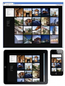
Original article @ DigitalFamily.com Responsive web designs, respond to the change in a screen size by adjusting the layout of the page.In the world of web design, the only thing harder than keeping up with the ever-evolving standards in HTML, CSS, and other technologies, is keeping up with the vocabulary.Among the latest hot new terms in web design: Responsive Design and Adaptive Design.Many people are using these terms interchangeably, but creating a distinction between them does help clarify two different approaches to the modern challenge of design web pages for multiple screens.This architectural website is a great example of Responsive web design. -->
What Responsive and Adaptive web design have in common
First, what they have in common. Both responsive and adaptive web design are essentially about creating web designs that are optimized for the size of the screen or the type of device that is used to view them.The basic concept is that instead of creating one web page designed for one target screen size, you create a web designed for multiple screen sizes, most commonly to work well on at least three different screen sizes — a small mobile screen, a tablet-sized screen, and a larger desktop computer monitor.In recent years, most web designers have created page designs that are 960 pixels wide so that they fit comfortably on a computer monitor that is 1024 by 768. But today, you need to design for everything from a 320-pixel iPhone to giant HD TV screens, which are increasingly being used to surf the web thanks to Google and Apple TV devices.
Okay, so what’s the difference between responsive and adaptive web design?
 Learn how to design for multiple devices using the new Fluid Grid Layout features in Dreamweaver CS6 — order Janine’s latest video. -->
The simplest and most common way I’ve seen these terms compared is:
- Responsive designs respond to changes in the size of a browser window by fluidly ajusting the width to fit the space available. Thus, as you drag the side of a browser to make it larger or smaller, you’ll see the design change in realtime. Changes to a responsive design includes adjusting the size and positioning of elements to better fit the space available as you see in this example.
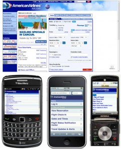
- Adaptive designs are generally based on a defined set rules based on device capabilities, as well as screen size. As a result, the change to the design may be more dramatic, and there may be many variations. Using device targeting, you can adapt a web page to include multiple versions of images or to remove video from the smallest screens. In many case, you may not even be able to tell that a website is designed using an adaptive approach if you only view it in a desktop web browser. The most advanced adaptive web designs, such as the one American Airlines created at aa.com, use a sophisticated auto-detection script to identify each device that visits the site and then deliver the best version of the site, adapted to display based on the size and capabilities of each device.
An adaptive web design may change the content delivered to each device, not just the size of the design area
If you have developed a fully adaptive mobile web design strategy, you may deliver a page that includes multimedia (video, audio, aniation) to your desktop users, and then adapt that entire page design to more limited mobile devices by not only changing the design, but also removinge the video and large images before you ever serve the page to low-end cell phones. Similarly, you might make the phone number and directions more prominent in the version designed for mobile phones, while featuring a video introduction, more prominently for desktop users.
The technical details of Reponsive and Adaptive design
Responsive design uses media queries to apply CSS rules based on screen size (learn more about creating responsive designs with media queries).Adaptive design can be set up with media queries, but many adaptive designs rely on a more sophisticated device detection scripts that run on the server and are transparent to the user.In the case of adaptive designs, if you visit a website with a mobile device you may see a very different version of the site, than if you visit the page with a desktop computer.
A little history and credit for Adaptive and Responsive Design
The term Responsive Design is generally credited to Ethan Marcote. You’ll find his original essay on responsive design here.The term Adaptive Design has been around a lot longer, but some give credit for this term to Aaron Gustafson who wrote a book called Adaptive Design.Another terms get tossed around when we talk about mobile design “Mobile First.”Luke Wroblewski deserves credit for the term Mobile First, which means designing the mobile version of a site before you design the larger, desktop version (historically most sites were designed the other way around).
Learn more about Responsive / Adaptive Web Design
- Get inspired with these great examples of Responsive design.
- Designing for multiple screens: How to create responsive / adaptive web designs
- Creating a Responsive Design with the Fluid Grid Layout features in Dreamweaver CS6
- Get up to speed quickly with responsive design in Dreamweaver with Janine’s latest Dreamweaver video
image courtesy of adactio


 Mon-Fri: 8:30-5:00
 #7 3185 Via Centrale, Kelowna BC


